

(Case 01) Sales landing page redesign
Clearer landing pages, designed for their audience
A rebuild of the course and free-class landing pages for an online watercolor school, using Elementor’s new atomic editor and a reusable global style system.
- Client
- Escuela Pato Valentín
- Industry
- Online education · Art
- Year · duration
- 2026 · Ongoing
- Services
- Website design & development · E-commerce consulting
- With
- Dizconnect (opens in a new tab) (agency)
(01) The project in numbers
The project in numbers
7
landing pages rebuilt without touching the live originals
sections on Ritual de reconexión (down from 16)16went to 1025
reusable global classes, plus 18 brand variables19 px
base font size, designed for readers over 50
(02) The challenge
Long, repetitive landing pages that were hard to maintain
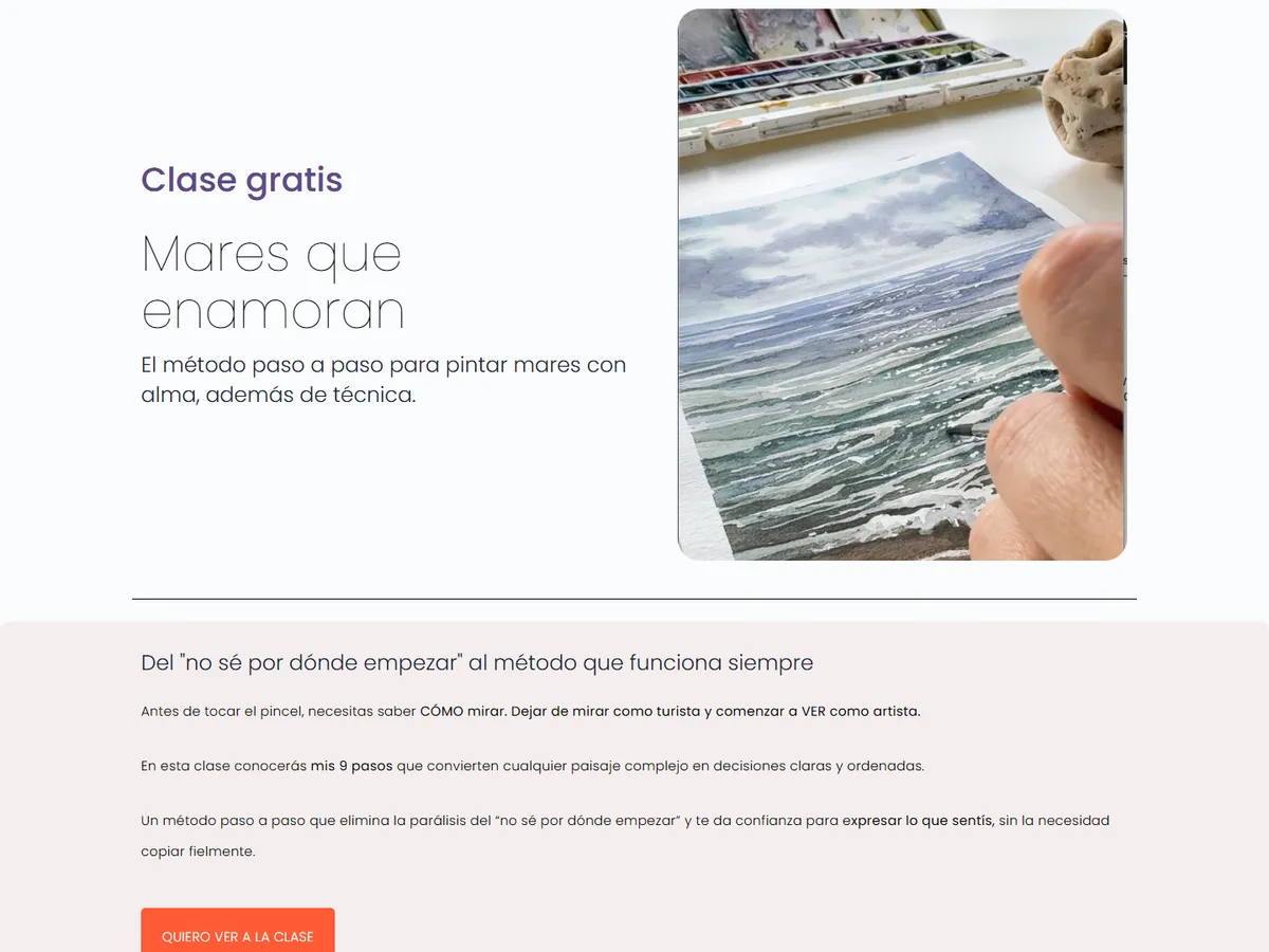
The course landing pages had grown piece by piece: up to 16 sections, testimonials scattered across four places, the course format explained twice, the bonuses far from the price and the FAQ split into two accordions.
On top of that, every page had hand-written styles, with small text and low contrast for an audience mostly over 50. Changing a color or creating a new landing page meant redoing the design every time.
(03) Before and after
The finished project
(04) What we did
5 steps, from problem to launch
Step 1: Restructuring each landing page
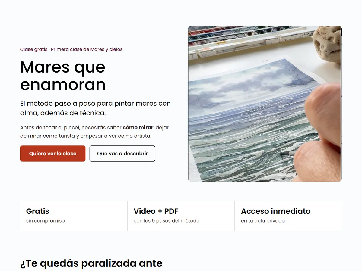
We merged the repeated sections and reordered the buying journey: promise, who it’s for, results, curriculum, testimonials together before the price, offer with bonuses, and FAQ.
Step 2: Global style system
Color and typography variables taken from the brand, plus reusable classes (buttons, sections, cards, accordions), so no page has hard-coded colors.
Step 3: Accessibility for their audience
19 px base text, higher contrast, 64 px tall buttons and FAQ items that are easier to tap on a phone.
Step 4: Built with Elementor V4
Seven new landing pages built alongside the originals, with FAQ structured data for Google and the Brevo forms and WooCommerce checkout in place.
Step 5: Documentation and rollout
A guide to edit the landing pages and create new ones with the same styles, and a phased plan to move them to the live site with a way to roll back.
(05) Tools
Tools used
- WordPress
- Elementor V4 (atomic editor)
- Elementor Pro
- WooCommerce
- Brevo
Results depend on where each business starts. In the free audit I'll tell you what to realistically expect in your case.